
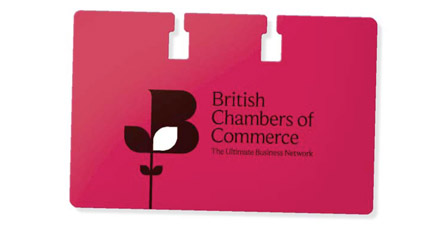
In a very blue world of fragmented identities, the British Chambers of Commerce, or BCC, had little national visibility. A new brand identity was needed that would combine vibrancy and authority and capture the essence of the BCC’s business objective.
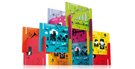
Asked to carry out the rebrand, Elmwood developed a new logo which became known as ‘the growing B’. Sitting atop a leafy stem, the B was conceived as a symbol for business growth, while a vine conveyed the notion of an extending network, with each element applied across brand cards, brochures and website. Vibrant colours, and classic and modern fonts, were also carefully selected.
In the two years since the rebrand, sponsorship revenues have increased by 110%, and road-show sponsor attendees have risen by 175%. The BCC is now highly visible, with Director General David Frost the very public voice of British Business during the credit crunch.