
In 2006, Heinz recognised that their iconic Classic soup range was beginning to look a little jaded. Lacking the contemporary feel of other soup brands, Heinz wanted to overhaul and reassert the brand as a market leader.
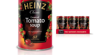
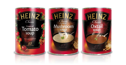
Cowan London were called in to take the project forward. Retaining iconic cues from the original Cream of Tomato Soup, Cowan created a new can design intended to bring stature, appetite appeal and modernity to the mainstream ambient soup category. A warm strong red was used to achieve shelf standout; ‘Heinz’ was reasserted through the use of uppercase lettering, while a real ‘soup moment’ was captured via a steaming bowl visual.
Within six months the redesign alone had driven a 3.6% increase in volume. Within 12 months, thanks to the new packaging, another 15 million cans left the shelves, and across the 400g singles range Heinz saw base sales grow by +10.4%.