
Inspired by his recovery from cancer, David Luks wanted to challenge popular soft-drinks and create a natural thirst-quencher that was delicious as well as healthy. But in a rapidly expanding category, his new product, Deluxe Honeydrop, needed a unique look-and-feel if it was to stand out from the crowd.
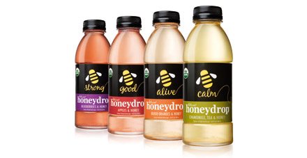
Pearlfisher were commissioned to create an impactful brand identity. They responded with a fresh, simple and visually striking solution. Utilising a honeybee icon, they did away with on-pack clutter to communicate the product message clearly. Unique colours and descriptors were used to create variant differentiation and strong in-store presence, with the each of the four bottle designs exuding natural energy.
In just three months after launch, Deluxe Honeydrop’s 4 SKUs outsold the leading competitor’s top 4 SKU’s in New York City. Since then sales have increased by an average of 94% per month, with distribution reach widening and brand awareness growing.