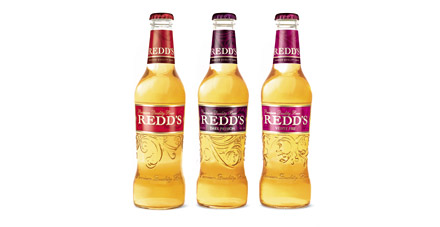

REDD’S light, sweet beer for women was an instant hit when it launched in Russia in 2004. But its success prompted others to follow suit, and by 2007 an overcrowded light-beer market had seen REDD’S volume share fall by 2.6%.
Pearlfisher were called in to transform REDD’S identity to help it compete with its classy new rivals. In their redesign the agency focused on bringing femininity and premium style to the fore. The logo was elegantly re-crafted, and the label changed to a belt-like strip, accentuating the bottle’s curves. The can, meanwhile, was given a sleek, matt finish, differentiating REDD’S from other brands.
In its first year, the new bottle design saw total volume sales grow 22%, while can sales led to a growth in market volume of 26% within four months. And in October 2008 REDD’S recorded a 77% trial rate, the brand’s highest ever influx of new consumers.