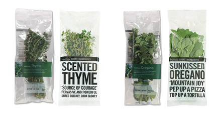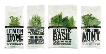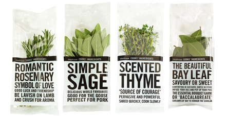


Fresh herbs were a small part of Waitrose’s fruit and vegetable category, with generic designs that created little shelf presence or encouragement to purchase. Waitrose wanted to re-invigorate the category, increase sales and capitalise on the trends towards ‘scratch’ cooking.
Lewis Moberly came up with new labels and pack designs that featured a strong, copy-led style. Using simple black and white graphics, the idea was to allow the fresh green herbs to be the hero. Each label told its own story, presenting interesting facts about herbs, and encouraging consumers to re-evaluate and engage with the product. The result was a fresh, inviting and mouth-watering range.
The redesign led to a 5.1% increase in penetration within the Waitrose herb category, and a 6% market share increase between 2007 and 2008. Consumer response to the new packaging was overwhelmingly positive and design costs were recouped within two weeks of sales.